
What a Pareto chart is
A Pareto chart is a bar chart sorted in descending order with a cumulative percentage line, showing which causes account for most of a problem. It is one of the basic quality tools and helps decide where to act first.
The name comes from economist Vilfredo Pareto, who observed how wealth was concentrated in Italy. Joseph Juran brought the idea to quality as the "vital few and trivial many": a few causes usually account for most of the effects.
Pareto chart visual map
The map shows the steps, the example table and chart, the 80/20 principle and the areas of application.
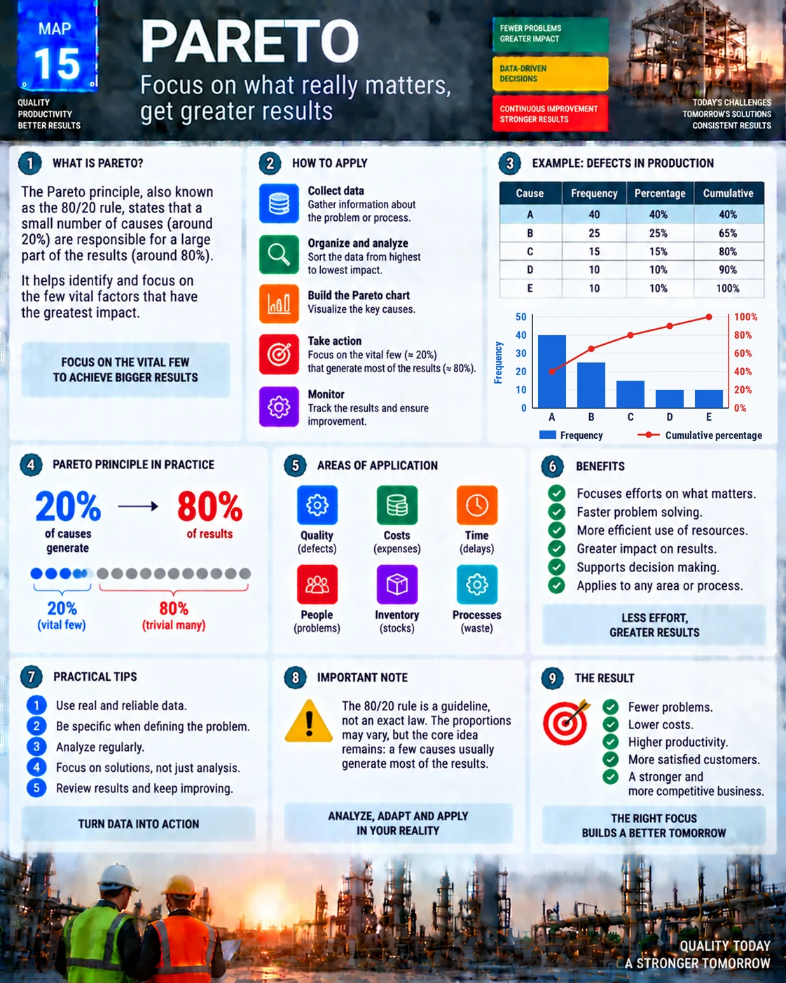
Example: 100 defects on a production line
| Cause | Frequency | Percentage | Cumulative |
|---|---|---|---|
| A | 40 | 40% | 40% |
| B | 25 | 25% | 65% |
| C | 15 | 15% | 80% |
| D | 10 | 10% | 90% |
| E | 10 | 10% | 100% |
Causes A, B and C add up to 80% of the defects. Tackling those three first solves most of the problem; D and E come later.
How to make one, step by step
- Collect data on occurrences over a defined period, with clear categories.
- Sort the causes from highest to lowest frequency (or cost).
- Calculate each cause's percentage and the cumulative percentage.
- Build the chart: bars for frequency on the left axis and a line for the cumulative percentage on the right axis, from 0 to 100%.
- Take action on the causes that make up the first 80% and monitor whether the chart changes.
In Excel, the Pareto chart is under Insert, Insert Statistic Chart, Histogram, Pareto.
The 80/20 rule is a guideline, not a law
The idea that 20% of causes produce 80% of effects is a practical reference. The proportions vary: in the example, three of five causes (60%) add up to 80%. What holds is the principle: a few causes usually weigh far more than the rest, and that is where effort pays off.
Tips for a good Pareto
- Weight by impact: a Pareto by cost can change the order of a Pareto by count.
- Stratify: build Paretos by machine, shift or product to see where the problem concentrates.
- Drill down: the biggest bar can become a new Pareto of its sub-causes.
- Watch the "other" bar: if it is large, the categories are poorly defined.
Areas of application
- Quality: defects and complaints.
- Costs: losses and waste.
- Time: causes of delays and downtime, including OEE losses.
- People: accidents and recurring problems.
- Inventory: items with excess or shortage.
- Processes: inefficiencies in the office and on the shop floor.
Once the priority bar is chosen, the fishbone diagram and the 5 Whys help find the root cause.
Common mistakes
- Using data from memory instead of real records.
- A poorly defined problem or overlapping categories.
- Making the chart and not acting on it.
- Not repeating the Pareto after the actions.
- Treating the 80/20 rule as exact.
Frequently asked questions
What is a Pareto chart?
A bar chart sorted in descending order with a cumulative percentage line, used to show which causes weigh most in a problem.
What does the 80/20 rule say?
That roughly 20% of causes tend to produce roughly 80% of effects. It is a guideline, not an exact rule.
How do you calculate the cumulative percentage?
Add the percentages in descending order: 40%, 40% + 25% = 65%, 65% + 15% = 80% and so on.
How do you make a Pareto chart in Excel?
Select the causes and frequencies and use Insert, Insert Statistic Chart, Pareto.
How do Pareto and fishbone diagrams work together?
The Pareto chart shows which problem to tackle first; the fishbone helps find that problem's causes.
Sources
- JURAN, J. M.; DE FEO, J. A. Juran's Quality Handbook. New York: McGraw-Hill.
- ISHIKAWA, K. Guide to Quality Control. Tokyo: Asian Productivity Organization.
- TAGUE, N. R. The Quality Toolbox. Milwaukee: ASQ Quality Press.
Want to prioritize with data?
Download the free "Problem Solving Kit" e-book, with PDCA, A3, 5 Whys and Ishikawa.
Download the e-book
About the author
Lean Manufacturing & Behavioral Management Specialist
Over 20 years in the automotive and metalworking industries (GM and Dana), Lean Manufacturing practitioner since 2006. SENAI instructor and mentor in Brazil’s Brasil Mais Produtivo program, delivering consulting, training and audits for 50+ companies, combining quality, productivity and people development.